Heading Guidelines for Drupal 8
Overview
Headings tell assistive technology users how your web page is structured. The heading markup comes in 6 “levels”, with <h1> (level 1) being the most important heading, up to <h6> (level 6) being the least important heading.
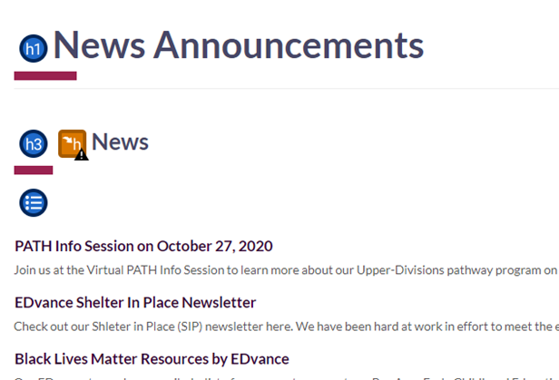
The first heading level, <h1>, is the most important heading to include on a page. The title of a page is the perfect element to make an <h1> element, since users will know exactly what the page is about, ex. “News Announcements”. If a page was to start with an <h2> element instead, no one would have any idea of what the page is about, as they’d only think that there are subsections of the page since the main heading level, <h1>, is not present.
Using Browser Extensions for Accessibility
One way to help check for heading levels on a page is by using the WAVE Browser Extension, which marks up all the heading texts with symbols highlighting their heading levels.
In Figure 1 (below), the extension has shown that the “News Announcements” text is an h1 element, and the “News” text is an h3 element. You can download WAVE on Chrome, Firefox, or Microsoft Edge.
Commonly Found Accessibility Issues with Headings in Drupal 8

The page shown in Figure 1 has skipped the <h2> heading level, which violates one of the rules for heading levels in Drupal 8.

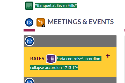
Do not use headers as a means to resize text, as demonstrated in Figure 2. Doing so can confuse users into thinking that some mislabeled headings are more trivial than the other headings on the page.
To resize text, use heading levels appropriately - to fix the site in Figure 2, the h3 “Meetings & Events” element needs to be changed to an h2 element, and the h2 accordion tab elements must be changed to h3 elements.

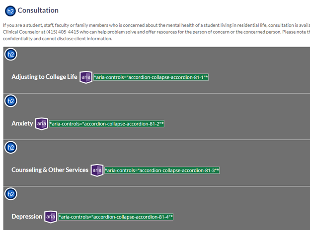
Although Figure 3 seems to have no orange warning marks from WAVE, the accordion tabs and the section text all have the same heading level: heading level 2 (<h2> elements). Screen reader users will think that this page contains multiple accordion tabs and dropdown menus, which is not the case.
To alleviate this issue, the editors of this page can change the accordion tab headers (e.g. “Anxiety”, “Counseling & Other Services”) from <h2> elements to <h3> elements so that screen reader users are able to know that the page has a subsection title and accordion tabs on the page.

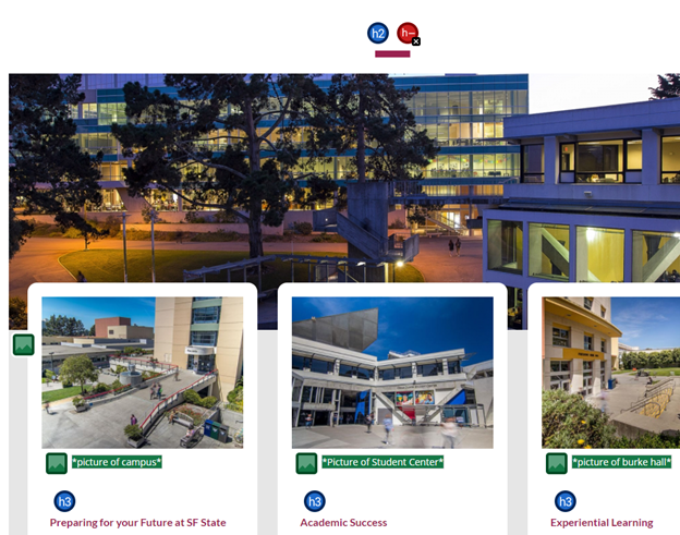
Ensure that your pages do not contain empty card titles or other heading elements, as this can confuse screen reader users into thinking that there are unannounced headers on the page when they are actually empty. If empty heading elements are left on a page, as shown in Figure 4, screen readers will announce nothing after stating the element (e.g. “heading 3, ____”), which will confuse users into thinking the screen reader is buggy and not announcing anything.

In Drupal 8, some headings may not be able to be manually removed or edited. Figure 5 (shown above) displays a page where the empty h2 element cannot be manually removed due to Drupal limitations. In such cases, add some title text to describe what the section is about. It is not advised to leave these headings blank, as blank headings make it less clear on what the subsection of the page is about.